


- Welcome to Creator Forum - Racial Loyalty News Online.

|
||||||||||||||
Download Item |
||||||||||||||
| Previous Image | ||||||||||||||
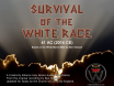
| Description: Survival of the White Race - Original front album cover
Stats: Filesize: 403.66kB Height: 1705 Width: 1834 Keywords: Survival album cover Posted by: Rev.Cambeul  Tue 26 Feb 2013 Tue 26 Feb 2013
Image Linking Codes
|
||||||||||||||
| 0 Members and 1 Guest are viewing this picture. | ||||||||||||||
| Related Images | ||||||||||||||
|


Comments (5) 
|
Rev.Cambeul
. . The Shotcaller . . Church Admin Forum Hang-Around Posts: 10,479 | Tue 15 Sep 2015 The modern font of the logs typeface  Follow the Gallery link to view full size http://creativityalliance.com/forum/index.php?action=gallery;sa=view;id=1536 [Report Comment] |
|
JamesCostello
Sentence 5 Years P.O.W. Forum Hang-Around Posts: 4 | Thu 26 Feb 2015 Nice picture, but I'm not keen on the font. Maybe it was fashionable at the time? It does remind me of an old vinyl record cover, for country music or something. Much prefer Rev. Cambeul's updated version.  [Report Comment] |
|
Rev.Cambeul
. . The Shotcaller . . Church Admin Forum Hang-Around Posts: 10,479 | Fri 19 Dec 2014 We will be reusing a more modern version of the same log cabin type face/font for our new updated recording by Mr James Mac. Stay tuned for details [Report Comment] |
|
Chuck
Forum Hang-Around Posts: 63 | Mon 18 May 2009 Klassen was infatuated with the Winning of the West, as you well know and this typeface reflected that, I think. It also has a Natural look to it, which stresses the origins of our religion in the Laws of Nature. If we had to do it all over again today with modern technology, I would have suggested we ought to do something slightly different with the typeface, maybe use some font that's a bit more timeless, but that's just me. I think the logs look slightly silly and don't properly lend the required dignity to a subject matter which is so serious. On the other hand, it does get your attention, so that's good advertising. [Report Comment] |
|
Albert
Forum Hang-Around Posts: 419 | Mon 13 Oct 2008 Thats actually quite an odd typeface to use. Logs? Rustic? perhaps natural? [Report Comment] |
Powered by SMF Gallery Pro

|
Legal Notices The Church of Creativity is a Professional, Non-Violent, Progressive Pro-White Religion. We promote White Civil Rights, White Self-Determination, and White Liberation via 100% legal activism. We do not promote, tolerate nor incite illegal activity. [More ...] Creator Origins Church of the Creator: Founded by Ben Klassen - Year Zero (1973CE) Your Own Creator Forum: Continuously Online Since 25AC (1998CE) Creativity Alliance & Church of Creativity: Founded 30AC (2003CE) Links: The History of Creativity | The Creator Calendar Explained » Save the White Race - Join the Church of Creativity « 23 Words What is good for the White Race is of the Highest Virtue; What is bad for the White Race is the Ultimate Sin. Copyright © 30 AC - AC (2003 CE - CE), Creativity Alliance. All Rights Reserved. Back to the Top |